Google Cloud Traffic Visualization
Data Visualization

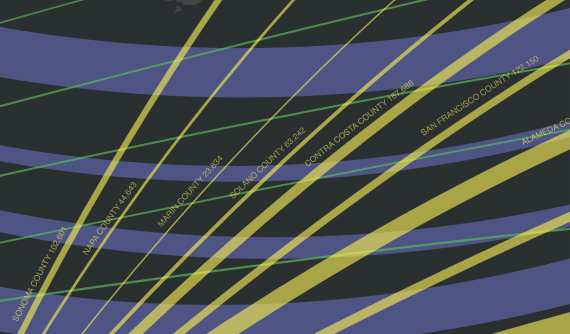
Bay Area Melting Pot: A Region of Immigrants
Data Visualization

Hey there, this is the default text for a new paragraph. Feel free to edit this paragraph by clicking on the yellow edit icon. After you are done just click on the yellow checkmark button on the top right. Have Fun!

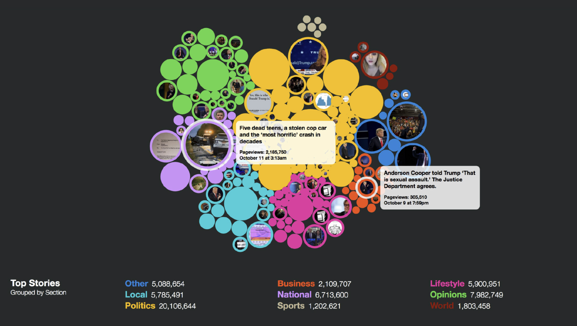
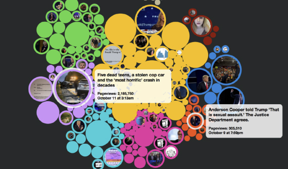
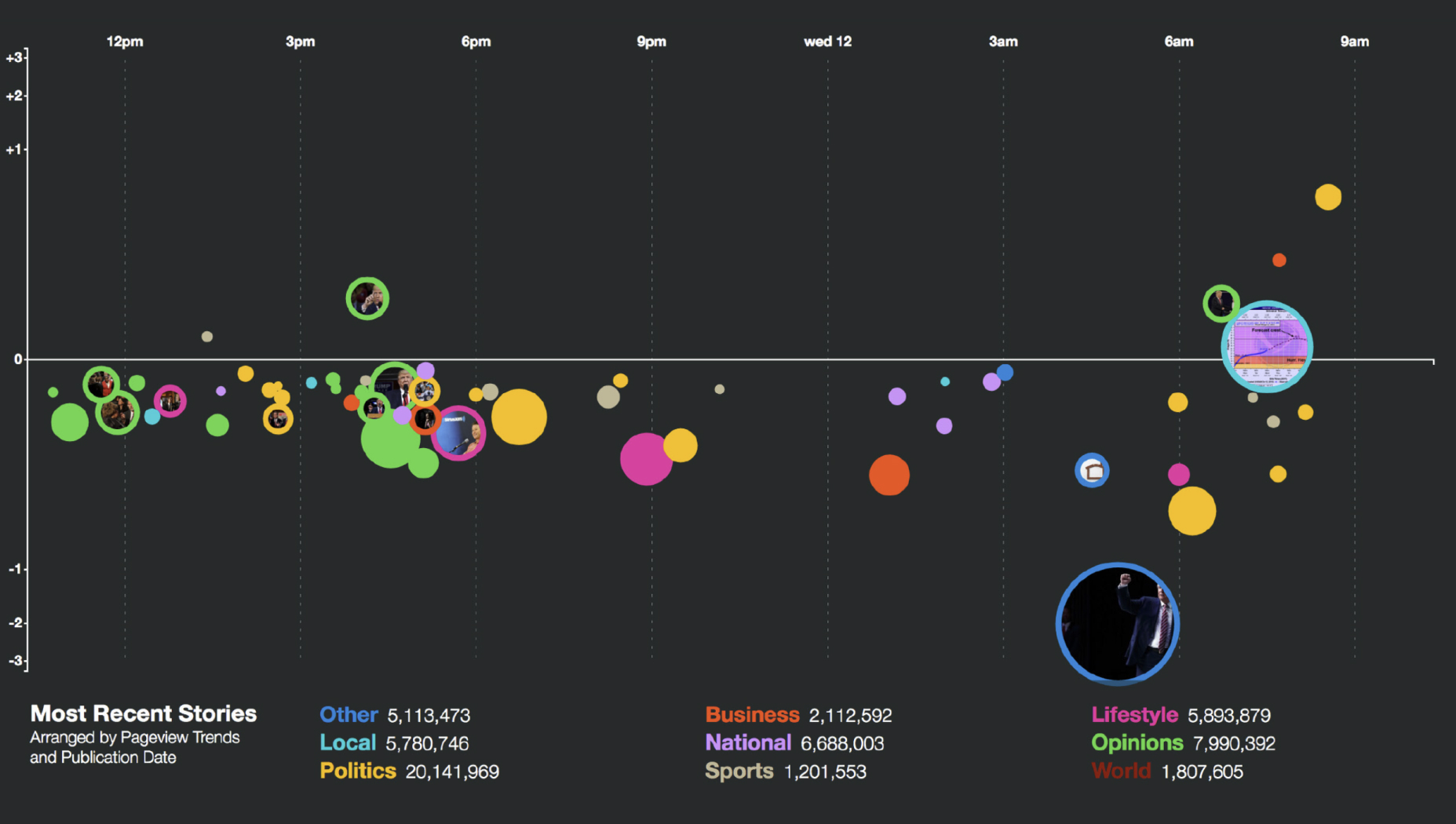
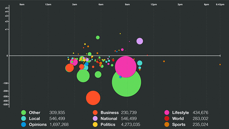
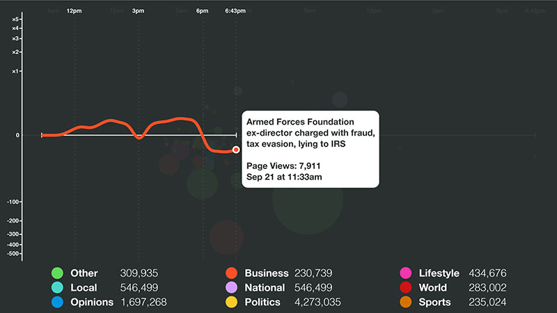
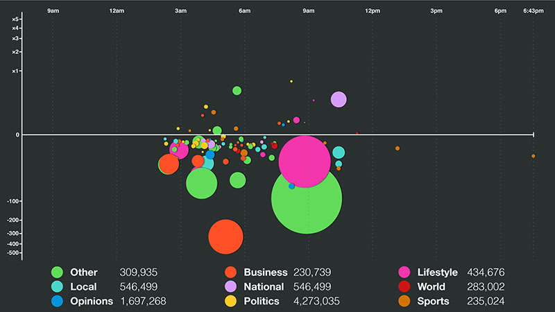
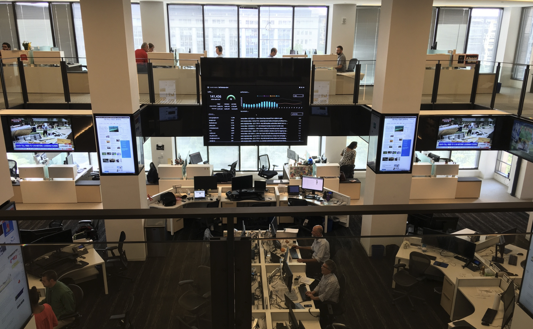
Real-Time Traffic Visuailizations for The Washington Post
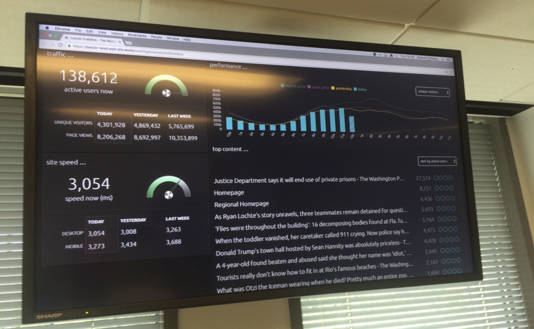
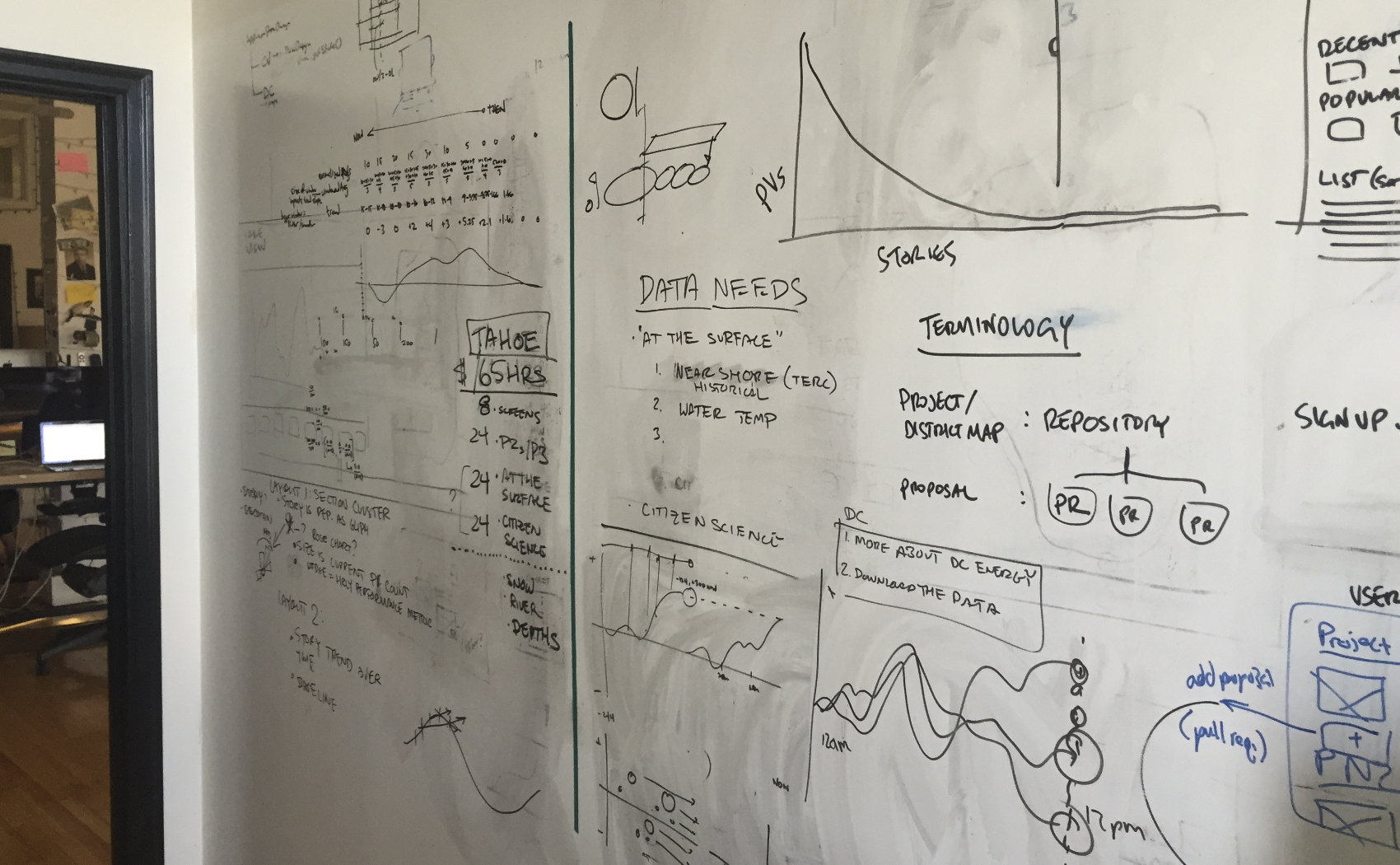
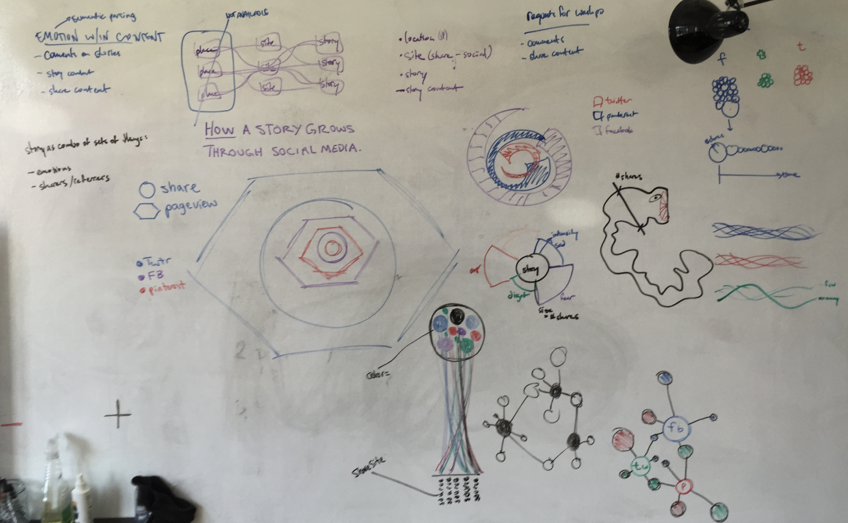
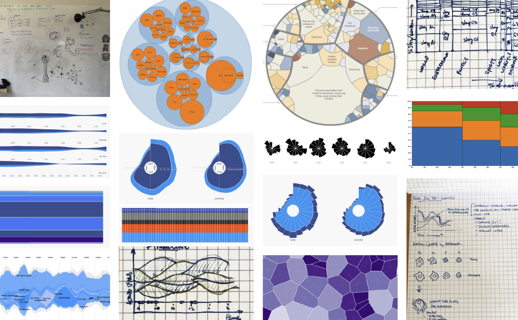
While at Stamen I had the opportunity to work with The Washington Post to create a real-time visualization displaying traffic on their site. The visualization had two different forms: a trend graph that showed if stories were trending up or down (reflected on the y-axis) and a cluster chart that showed page views for each story (each circle is a story with the diameter representing page views) grouped by section in the paper (signified by the color). Intended to be running 24/7 in their news room, with these two views their team could at a glance see which individual stories were trending in a positive or negative direction, which were receiving the most page views, and the proportion of views each section wac contributing.
You can read about how we achieved these views in this technical blog post.
Research & Data Sketches
Work Samples
Google Cloud Traffic Visualization
Data Visualization
Bay Area Melting Pot: A Region of Immigrants
Data Visualization